On the Search for a Rainbow (#302)
Colour is so much more than one’s screen manufacturer’s idiosyncratic choice subject to calibration precision of electromagnetically reifying 24 bits.
Earlier yesterday, I marvelled at the cherryblossom hues with which the rising sun had dyed long strands of cloud, all peeking inclined in synchrony behind lush greens of hilltop, set in front a greyish-lightblue sky. The written word will only illicit an inkling of that fleeting moment, an every painting fashioned to eternalize its makeup destined to re-dress an incomplete assessment. Whereas the pigment lying thick atop the canvas envisages the very same sun which brought about the scene as aid to once again pay tribute to times gone by, discretized renderings must dread to contemplate their own form, for there is no salvation from fakery.
It’s not the semiotic bluff which weighs heavy on the ontology of hues: let language not be of concern, consider every word opaque without bounds! Can I perceive polarized light? Is Olo a colour? Does time play a part in the colour of oil films, their ripples precluding a static view? Are holographic elements on Euro bills a colour? Is anthracite a material property unique to pure coke of coal or a colour? What colour is a polished petrol autobody? Can non-iridescent nanostructures be considered a colour? Do LCD viewing angles change the screen’s colour? Is green perceivable by the majority of earthly life because it is near the maximum of the unimodal black body emission of our sun? When the winding tightness of the topological covering of the electromagnetic frequencies in common use depends on Goethe’s colour perception over a century ago, do trichromats then perceive different breadths of the elusive pink, a discontinuous illusion between wide and narrow waves? We know that the image’s framing can trigger perceptive heuristics that alter our experience. Does it go as far as that my believes in wherefrom I watch nature unfurl changes the colours I see? What beauty am I never to witness due to not being born a tetrachromat?

My father was in need of a graphic illustrating the visible spectrum, which is hard to draw by hand⸺he had tried.
Back when I was in middle school, I remember some of my classmates, always boys, not being able to order their, or anyone else’s, coloured pencils according to the rainbow⸺where black, white and greyscale where put at the desginated desaturated left, yet brown was always a curious outlier.
Since at least 1992 (Levkowitz and Herman 1993) we know how to subdivide the sun’s spectrum into six equidistant parts and linearly interweave the three additive primaries (Pseudonymous “Goffrie” 2006), which all modern output devices happily emit back. Though banding occurs at those interpolation nodes, and the perceptive gradients are irregularly non-linear.
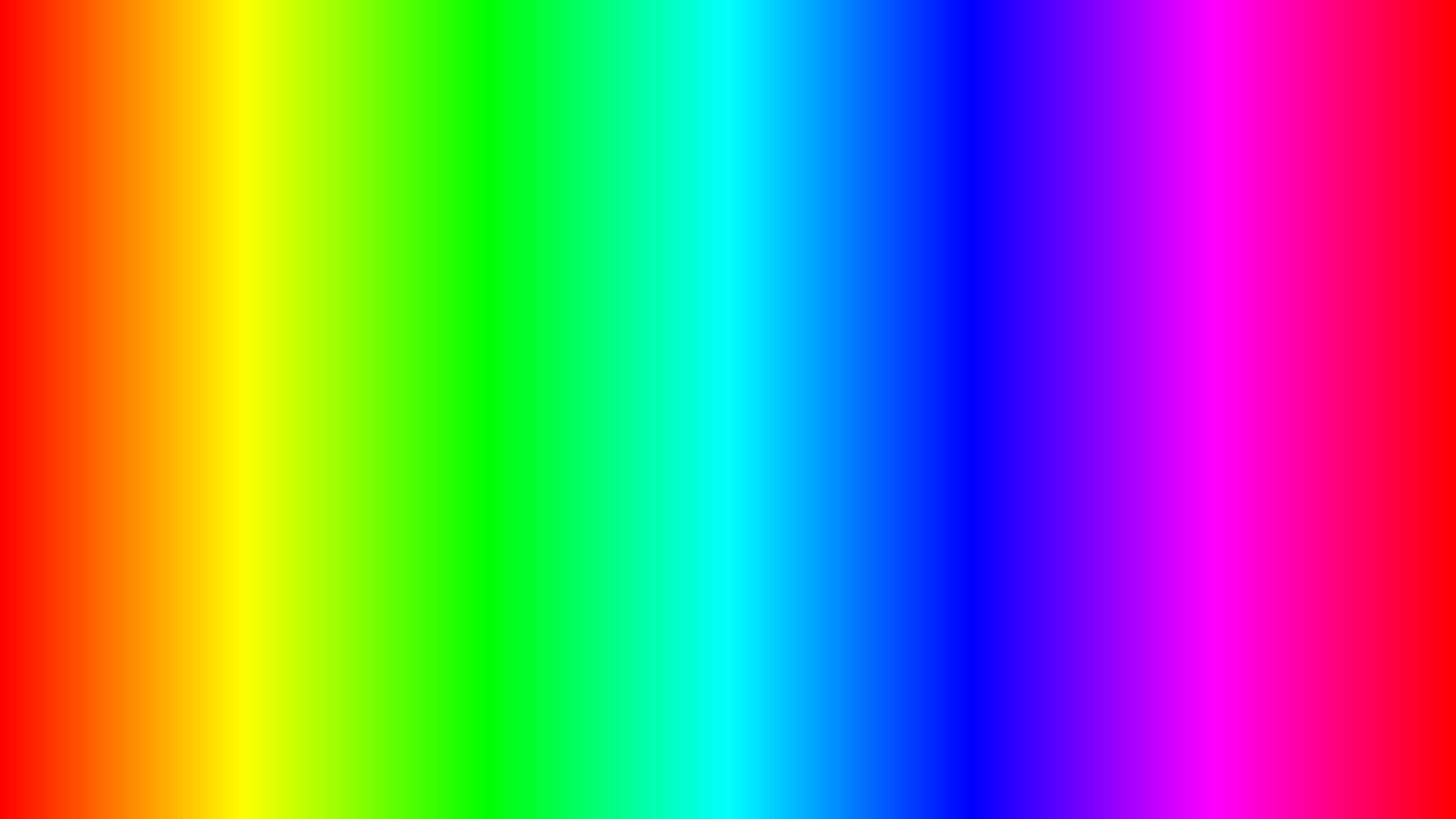
I had implemented hsl2rgb back in 2020, in C, and used it to colour in my homepage’s sections’ initial, pixel-stylized letters. Though HSL being as standard as it is, I had played with and implemented the conversion routine for said colour space already years prior, cf. Rainbowify.
Curiously, photographing a prism held in intense noon sunlight isn’t as picturesque as certainly I had surmised it to be, or maybe better put isn’t as egalitarian in its divvying out space for white’s split constituents to rest. Whether the discoloured stripes (faintly visible within the green, orange and darker blue regions in the photograph above; more visible in other, less blurred photographs my father took of the prism’s spectrum, which aren’t shown here) are our sun’s Frauenhofer lines or the prim’s glass’ material absorption characteristics, irregularities in the CMOS sensor, miscalibration of the monitors I looked through or something else alltogether, I do not know.
Björn Ottosson’s Oklab (Ottosson 2020), one of the great success stories of an open internet of this decade, is the contemporarily accepted answer to esthetic hiccoughs in colour gradients, and I thought it would surely define an impeccable rainbow.
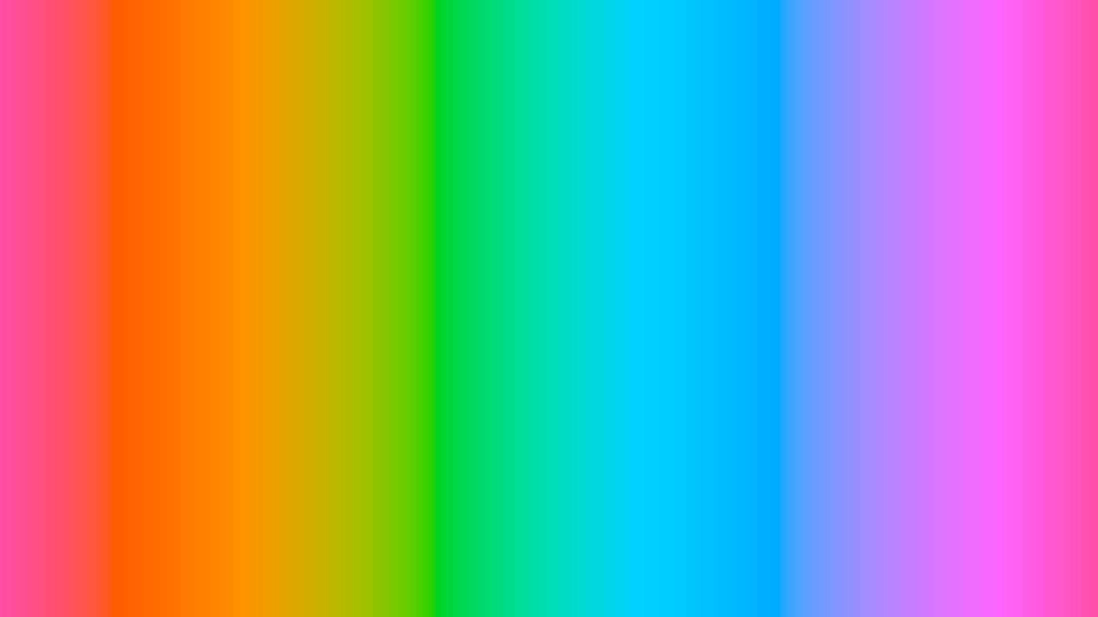
After some time tweaking lightness and chroma constants (HSL’s choice of full saturation and dead-middle luminosity leads to obviously improper Oklab results) paired with the usual absurdist graphics bugs that come from pixel data overflow, and after stopping to interpret linear sRGB as graphics formats’ RGB pixel values, I arrived at the pastel gradient seen above. Less garish than HSL’s rainbow.
What’s missing from the Oklab rainbow are vibrant reds and vibrant blues, which both are visible in the photograph of our sun’s spectrum, so their vibrancy cannot be a learnt expectation from decades of viewing HSL-powered imagery. More disappointingly, banding or uneven patches still exist, although less severe in appearance. Yet these might be due to a plethora of reasons, including but not limited to my tech stack’s rendering pipeline being optimized for a HSL-first world, or neither my monitor nor my operating system nor my image viewer nor my image format decoding library being properly perceptually calibrated. Or my room’s light scatter meddling with how I see my rendered spectrum.